Paint is so much more than just a color. The shade you choose can polish off your room perfectly or totally throw off the feel of the space. With so many hue and shade options, paint should be the last thing you select. What?! I know. I just said the mood can be set or thrown off by the paint but also that you should select it last.
Why is that?
Well, it’s a lot harder to find a couch that you love, comes in a color and size that you’re looking for, AND goes the shade of paint that you already selected. If you have your sofa, rug, and case goods all picked out, you can play with the tones and colors of your paint to get the vibe right.
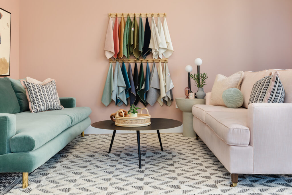
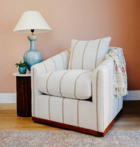
Pictured above: Sherwin Williams Cabbage Rose in our furniture showroom.
One of the biggest mistakes that people make is not looking at the swatches enough. You should view a large swatch in your space at multiple times a day from multiple angles. Fortunately, most paint companies are now offering sticker swatches so you can move them around without having to worry about covering them later.
We have three brands that we love for their color selections and paint quality. Benjamin Moore, Sherwin Williams, and Farrow & Ball are all amazing choices and you can’t really go wrong with any of them.
Because you always need a solid white paint, Claire loves Benjamin Moore Chantilly Lace. It’s the perfect neutral white-not too yellow or blue. Rebecca believes that white paint needs a little bit of body and her fave is Greek Villa from Sherwin Williams. It’s warm without being yellow and it feels cozy but not stark.
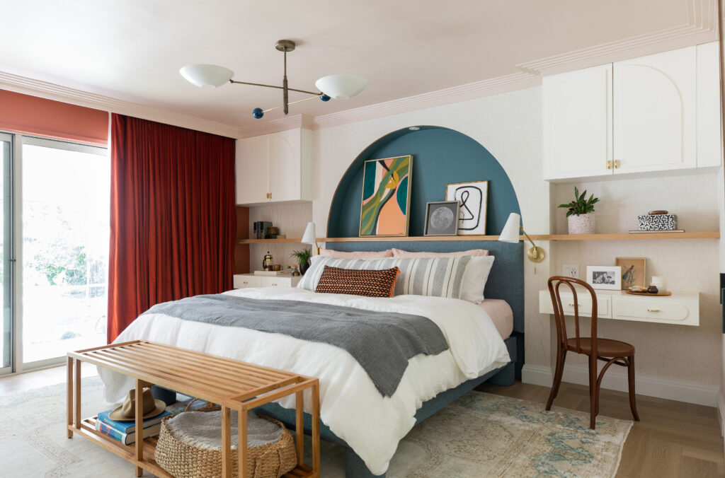
We also love the depth and richness that a good color gives a room. Rebecca loves Malted Milk by Sherwin Williams so much, she used it on her bedroom ceiling (pictured below.) It is the prettiest light pink without feeling like it belongs in a nursery. It’s a muddy blush that looks great anywhere that you want to add warmth.
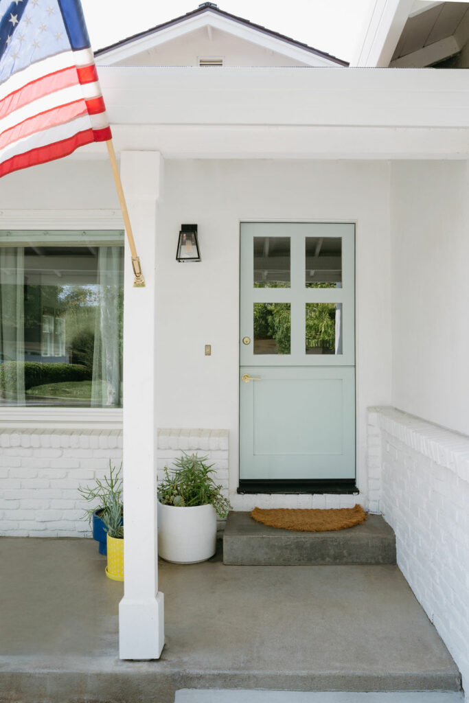
Claire loves Benjamin Moore Palladian Blue for its versatility. It’s calming and shifts throughout the day with the light. The ability to shift and play well with other colors gives it a bit of a chameleon effect so it can be dressed up or down. Below, Claire has used it on her client’s dutch door paired with Chantilly Lace on the exterior.